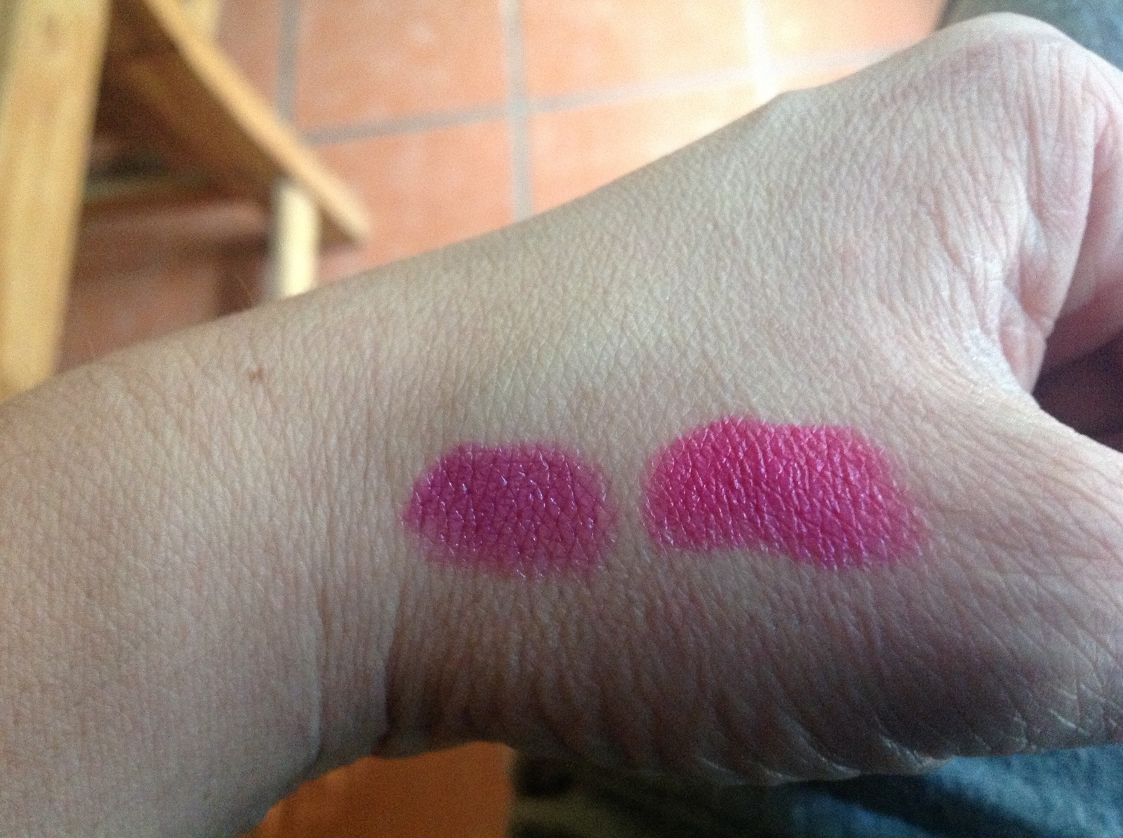
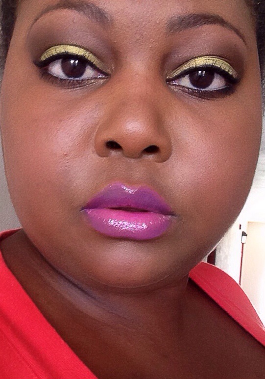
The blushes and the MSFs really are special, and unlike other ones. As Erine implied, there is a certain relationship between these MSFs and the EDSFs. But they are not the same. I'd say they really need to be seen and tested in person.
The eyeshadows are not so special. I mean, some are beautiful, but there is nothing so terribly different about them compared to previous Mineralize collections. So I'm repeating my review of the eye shadows. I don't like very dark shadows on my eyes, so they generally don't get a big thumbs up from me unless there's something amazing about them. Additionally, i do like glitter and shimmer and sparkle, but if you're not a fan of glitter, you probably won't like at least half of them.
I tested them DRY from lightest to darkest. They behave differently when wet, but i couldn't test them that way. All have fine glitter, some had more annoying glitter than others. All seem to be somewhat striated, so it's likely you can get each color out separately if you want to.
Dare to Bare - It may be "just another cream" as another reviewer said, but, well, i love it. In the pan it is creamy ivory and pale cool lavender. It goes on smoothly, the lavender gives a hint of color in some lights, and the sheen is ever so slightly pinkish. This is a very basic color for me, the kind i wear daily. I got this one.
Caribbean - i love pink eye shadows! But not this one. It was dry and the color went on patchy. At first, all i could see was the coppery glitter. It was a disappointment. I don't hate it, but it is definitely not at the top of my list.
Tropica - first you broke my heart by not being a lip liner, but you made up of it by being beautiful. It's a light-medium cool lavender with a lovely blue duochrome sheen. It went on smoothly with good coverage. Glitter is minimal. To me, this is the very best of the e/s in this collection. You are forgiven! Come to Mama!
Time to Tango - Blended together the cool violet and bronzy beige make a warm mauve-y/taupe-y lavender. It is almost neutral, so i think it will be very versatile. It has a fair bit of glitter, but it seems to enhance rather than detract from the shadow. I got it.
Cha-cha-cha - The chartreuse-yellow part was not as pigmented as i hoped, and the dark part was, well, dark, and not very distinct. Blended it made a dark khaki green. It was minimally glittery. I did not find it exciting.
Bossa Blue - I wasn't really sold on the two colors individually to begin with, but i like to give everything a try. You never know when something will be a pleasant surprise. Sadly, this was not one of those. Each color went on dry and patchy, and they were quite difficult to blend. It has minimal glitter, although the dark cerulean blue has some sheen. On me it just looked kinda dirty. It went to the bottom of my list.
