You are using an out of date browser. It may not display this or other websites correctly.
You should upgrade or use an alternative browser.
You should upgrade or use an alternative browser.
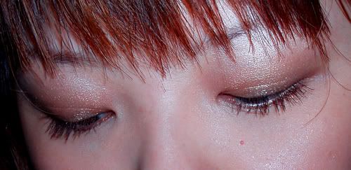
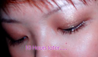
The Power of P+P Eye
- Thread starter Pei
- Start date
faithhopelove24
Well-known member
I like them all I think you look very pretty!
Beautiful1
Well-known member
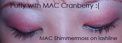
Cranberry Is Such A Beautiful Color. Your Make~up Is Sooo Pretty


Hikaru-chan
Well-known member
Looks lovely.
fireatwill
Well-known member
Nice job!


midnightlouise
Well-known member
Really pretty! I like both of these looks alot!
Villainiss
Well-known member
I like the cranberry on you! I agree that you should use another darker color in the crease, in order to add contrast. Otherwise, the light color on top fades into the cranberry, making it a rounding effect, instead of creating depth. Using the darker color will help to create the depth you're looking for.
Dreamergirl3
Well-known member
Very pretty pei!
Pei
Well-known member
Quote:
Thank u for explaining! Now I know what's wrong

Thank u for ur comments & advices!
| Originally Posted by Villainiss I like the cranberry on you! I agree that you should use another darker color in the crease, in order to add contrast. Otherwise, the light color on top fades into the cranberry, making it a rounding effect, instead of creating depth. Using the darker color will help to create the depth you're looking for. |
Thank u for explaining! Now I know what's wrong

Thank u for ur comments & advices!
pushhupsindrag
Well-known member
very good job!!
iheartmakeup
Well-known member
very pretty!


