You are using an out of date browser. It may not display this or other websites correctly.
You should upgrade or use an alternative browser.
You should upgrade or use an alternative browser.
MAC x Pedro Lourenço (June 5, 2014)
- Thread starter Mac-Guy
- Start date
Dolly Snow
Moderator
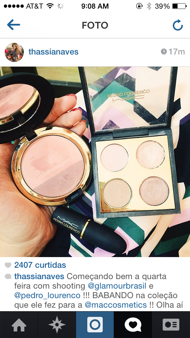
I love the look of The blush duo!Anothet pic (credit ig user) this time without filter (i think)
hazyday
Well-known member
Wow...love that blush duo!
josephine90
Well-known member
The blush and maybe the quad for me pending reviews
allthingsglam
Well-known member
Hehe me toI'm a heaux for special packaging!
allthingsglam
Well-known member
Thanks pretty but reminds me of somethingI love the look of The blush duo!
xasperadastra
Well-known member
that blush *____*
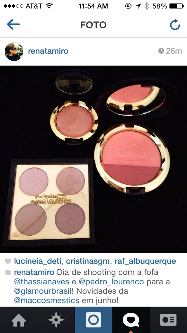
Coral-pink and plum, I guess the last pic is the most accurate so far. I don't think it's as muted as it looked in the first pics.Huh what color is that blush duo???
I really hope Mac changes the date. i still want the quad but wont afford it if it comes out the same day as the Osbournes.
kimibos
Well-known member
Coral- pink / plum? what and odd combination. and of course the plum part is in the shitty size. LOLCoral-pink and plum, I guess the last pic is the most accurate so far. I don't think it's as muted as it looked in the first pics.
Coral- pink / plum? what and odd combination. and of course the plum part is in the shitty size. LOL

Light coral-pink / mid-tone neutral plum is the full description.
bluelitzer
Well-known member
I'm in love with this packaging. So far this is my favorite packaging for this year. Just a beautiful matte black and gold lettering. Alluring Aquatic is fun but for me, this is nicer because it's sophisticated.
BrknFlwr85
Well-known member
How difficult is it to fit a brush in the smaller side of the blush duos in this style? I skipped Hibiscus Kiss from RiRi and missed out on the ones from Wonder Woman.
sureshedid
Active member
It's not super hard, especially with something like a 159 brush. I actually like this blush duo. Very pretty and pigmented, great texture to it also.How difficult is it to fit a brush in the smaller side of the blush duos in this style? I skipped Hibiscus Kiss from RiRi and missed out on the ones from Wonder Woman.
MACina
Well-known member
Coral- pink / plum? what and odd combination. and of course the plum part is in the shitty size. LOL

Tatiana87
Well-known member
Thanks for sharing.
martiangurll
Well-known member
ITA!I'm in love with this packaging. So far this is my favorite packaging for this year. Just a beautiful matte black and gold lettering. Alluring Aquatic is fun but for me, this is nicer because it's sophisticated.
vaisforluvrs
Well-known member
It looks like they are purposely designed that way because the Pedro Lourenco logo is just above the plum part.Is it necessary to check the blushes for color distribution or are they all evenly proportioned? Thanks in advance for any feedback


