Do not copy or link this review to any other forum or discussion board w/o my explicit permission!
Here are my thoughts on the Interior Life quad:*
-
Stratus is a very pale pink that has an icy matte finish. I use the term "icy" as it is rather cool-toned, though it has no shimmer, but it is not completely matte either on the skin. Unlike other reviewers, I didn't have any issues Stratus showing up on my skin, so if you are NW 20 and below, it will definitely work on your skin tone. I believe it works particularly well on NW skin as it is a cool-toned that will complement pink undertones. For those who don't want a shiny highlight, this is a great color: think mature browbones or those who get tired off the hundreds of frosty highlighters that are out there - Stratus is a great alternative. Texture-wise, it reminds me of Accentuate (Shape and Sculpt). It's very easy to pick up with a soft brush and there is no need to double-dip if you have lighter skin. It is a also good as a blending color.
-
Bruised Sky is a very light brown with mauve hues. It has excellent color-pay off and the name Bruised Sky is a very accurate description of it. It is a great lid color and I recommend dabbing it onto the lid and then blend it out rather than trying blend it immediately - otherwise it might end up patchy. This is nothing unusual for matte shades but a rather common issue - it all boils down to your application technique. BS is an extremely longwearing shade if applied over a p/p. I did not experience any creasing at all, which is one of the reasons why the matte formula is great.
-
Interior Life is a cool-toned light-to-medium grey tone in a Veluxe finish. On my pale skin, it is very pigmented, so a light hand is necessary when applying this shade. It works very well as a crease color or as a smokey liner on the lower lash-line. What is most fascinating about IL are the subtle cool undertones in blue and purple that makes this particular e/s so interesting. I don't have anything like it in my stash (which is huge). Due to the Veluxe finish, it is very easy to work with despite its matte finish. If applied with a light hand, the color can go from very natural to very dramatic on pale skin. Due to the longwearing formula (no creasing whatsoever), it is a great color for daytime that can easily be refreshed for a dramatic evening make up without changing the color scheme.
-
Heather Belles is a satin charcoal-ey e/s with a satin finish. I only use this to tightline and I assume this is the intention of this e/s rather than representing a crease color per se. It might also work on the outer V or to emphasize the lower lash-line.
All four colors work extremely well together and I would say that the color scheme is superior than some of the quads we have seen in the past. You can create a whole look with all four colors w/o pulling from other e/s.
Overall, this is a great quad if you look for cool-toned shades that can produce a natural look but can also be "oomphed up" to a very dramatic look. The matte formula of this quad is outstanding and all the e/s apply relatively easy considering that matte formulas are always drier than Veluxe Pearl. The fact that these colors are so longlasting make them ideal for people who do not constantly want to check they eye make up for creasing as the matte formula is less likely to crease than one with shimmer or frost finish. Mind you, the colors are very cool-toned, so if you have a very warm complexion, you might want to add another shade to warm up the overall tone of this quad. Last but not least: always use a freshly cleaned brush to work with e/s. Especially the matte formula can be difficult to work with if you swatch with fingers or use a dirty brush (e.g. one that has touched a p/p or has blended other colors). I can certainly see people having difficulties swatching the quad in the store if someone has used their fingers to swatch the colors. Oil and sweat are definitely the enemy of this quad. However, if you use common sense and clean brushes, this shouldn't be an issue. As I said above, the latter two colors are so pigmented that I had to use a very light hand.

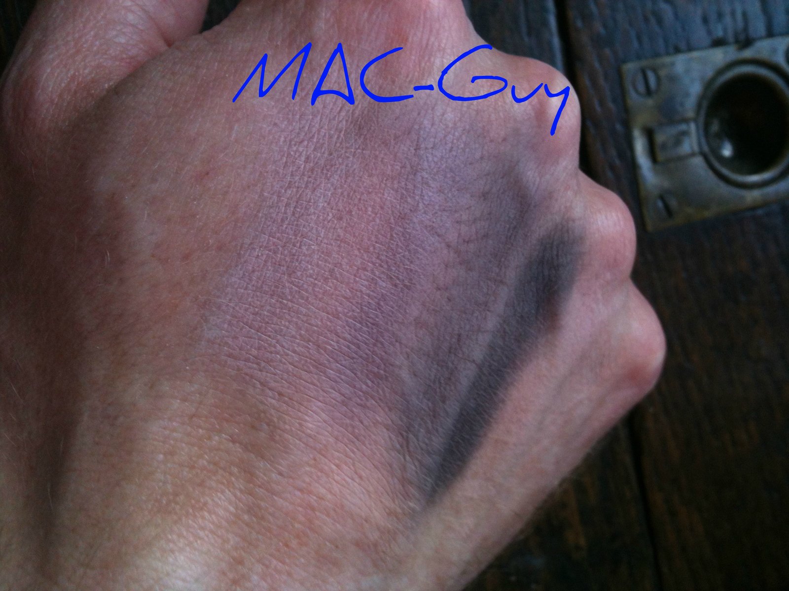
R to L: Stratus, Bruised Sky, Interior Life, Heather Belles. I found them very difficult to photograph. I'm sure there are better quality swatches out there.
* Apologies for the late review, but I did not take the quad with me on vacation.


