montREALady
Well-known member
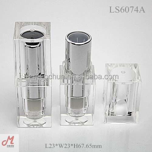
I actually think this looks better...without the goldIt looks like one of those lipstick tubes they sell for 10-50 cents a piece.


I actually think this looks better...without the goldIt looks like one of those lipstick tubes they sell for 10-50 cents a piece.


Me tooI actually think this looks better...without the gold :lol:
Same!!!!I think it's so cool! I love anything acrylic. I have been waiting for MAC to do clear packaging, so I'm happy. Dying to find out more about this. This and Guo Pei will get my money.
I didn't wanna say it, but that's what I thought too.I actually think this looks better...without the gold

I agree. It's marginally less hideous.I actually think this looks better...without the gold

I like the idea but not a fan of the gold ?? idk looks odd to me

This cannot be real. I had lipsticks in packaging like that when I was a k id because they were cheap and applied terribly so Mom didn't worry about me wearing them out of the house.. If that's real then what is wrong with MAC?
I wanted it all but nothing seemed to fit right. I did managed to snatch the clutch and I am almost over the fact that I didn't bought both colours.
Nicka K (a $0.99 beauty supply store makeup brand) has this acrylic packaging with silver...whilst I have a lot of love for Nicka K products (ESPECIALLY their Dodgy Girl dupe)...I'd have to take a huge step back from the MAC counter if their lipsticks looked like Nicka K's.I wanted it all but nothing seemed to fit right. I did managed to snatch the clutch and I am almost over the fact that I didn't bought both colours. And I am with those who think the clear tube would look better with silver. It would look less tacky and more futuristic. I thought that untill somebody posted the cheap lipstick tube picture.
I get that red is a classic and timeless color, but the red overdose is ridiculous. The Vamplify tube looks like the kissable ones, but I agree about the tacky font. At least it wasn't Comic Sans... The acrylic lipstick looks a DIY in which someone took out the tube and placed it on the acrylic part. It looks wobbly as hell and the gold part looks tacky. It would've been better if the packaging were round and the gold part be chrome or silver.
I agree with you 110%what an ugly cheap looking packaging....
My exact thoughts... Reminds me of kids makeup. I wondered if it was fake at first... Should be an easy skip at leastWow! Now that is the tackiest packaging I've ever seen! Dollar store quality right there!
That's crazy. IDK, how someone can think this is okay.Speaking of kids makeup... this is kind of blowing up in my FB newsfeed today:
http://www.cosmopolitan.com/style-beauty/news/a40774/you-should-stop-using-crayola-colored-pencils-as-eyeliner/

So agree with you. I bet it will be a bit hit on IG though.I love the idea of clear packaging, but not like that. MAC's literally just copied the packaging of the cheapest make-up available circa 1995. The only way to salvage that is to call the collection Dollar Store and claim it's ironic. It could potentially look cool if it was entirely see-through, including the gold part, or if the gold part had an interesting pattern on it. It would look much better if it was MAC's usual rounded shape, because square acrylic is pretty much the standard for cheap, low quality lipsticks.
The Vamplify packaging looks cheap as hell too.
I agree hahaI actually think this looks better...without the gold :lol:
:werd: Its hideous.Wow! Now that is the tackiest packaging I've ever seen! Dollar store quality right there!
