New business cards

Miss Pumpkin

Well-known member
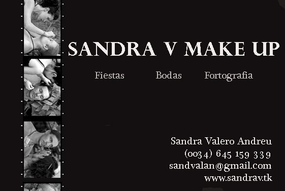
Here's my new business cards to match with the design of my website, let me know what you think!!!
graucho.gif


tarjetasbg4.png
 

MAC_Whore

Well-known member
That is fantastic! Very artfully laid out, I love B&W and they show you in action which tells potential clients that you aren't all talk, that you know what you are doing. The fact that you show male as well as female models demonstrates your versatility as well. Well done! Thanks for sharing
smiles.gif
 

user79

Well-known member
I like the filmstrip idea at the top, but the layout could be improved. Also, have you considered that the printing of such pictures may be quite difficult or costly to do?

I'd also suggest maybe trying out some different fonts for the lettering, that one looks quite plain. You can get loads of free fonts online, some have a more "professional" look to them.

smiles.gif
 

happy*phantom

Well-known member
nice idea... but i agree with misschievous. the layout needs some improvement. i would arrange the film strip in the centre due to the fact that everyone focus the middle. what about the use of the red color? it's a signal color and would be great in combination with black and white. mark the most important words with a red color and change the font.
i suggest a simple white as background color. so the letters and the picture are the prominent features of the card...
what do you think? are you ready for some changes?
smiles.gif
 

VeronikaJ

Well-known member
I truly think it's great the way it is. It's simple which is so understated but says so much. It conveys a certain look of androgyny that will appeal to all clients. Font looks great, too!
 

maxipoodle1

Well-known member
Quote:
Originally Posted by ..kels*
that looks amazing! i love how the top looks like a film strip. very cute!
greengrin.gif


yeah I like that too it looks so professionel!!...well that is what you are but still!
clap.gif
 

iLust

Well-known member
Quote:
Originally Posted by MissChievous
I like the filmstrip idea at the top, but the layout could be improved. Also, have you considered that the printing of such pictures may be quite difficult or costly to do?

I'd also suggest maybe trying out some different fonts for the lettering, that one looks quite plain. You can get loads of free fonts online, some have a more "professional" look to them.

smiles.gif


I also like the idea and the black and white, but agree with the above. Also, the small photos on the top will most likely be lost when printed, because a business card is pretty small to begin with (usually approx. 3.5" x 2") Maybe you could try making the whole "film strip" a bit larger, and with one less photo. Perhaps the smaller text below your name could be a cleaner, easier to read typeface, and aligned to the other text a little differently. I'm a graphic design student, so I'm still learning, but thought I'd give you my suggestion anyway.
smiles.gif
 

kaliraksha

Well-known member
I love it the way it is honestly... i mean you have a catchy top, very basic colors, and the business card part is where it "should" be in the bottom right... looks lovely... would love to see it done in high gloss card quality, but i know thats pricey =(

oh on more thing, personally i would have liked to see one more female model you were working on
 

bebs

Well-known member
this is what I would do.. but then again thats just me.. it gives a few less photos but it does give the information a bit bigger and eyecatching .. its just a few second redo over
 

kimmy

Well-known member
very nice! i love the simplicity of the design. and gosh sandra, you are absolutely beautiful.
smiles.gif
 

Miss Pumpkin

Well-known member
Quote:
Originally Posted by bebs
this is what I would do.. but then again thats just me.. it gives a few less photos but it does give the information a bit bigger and eyecatching .. its just a few second redo over

That's a really version I must say!!
I'll have to fiddle around with photoshop when I get home mwahahaha
THANKS!!
cheerleader.gif
 
Top