P
pockykami
Guest
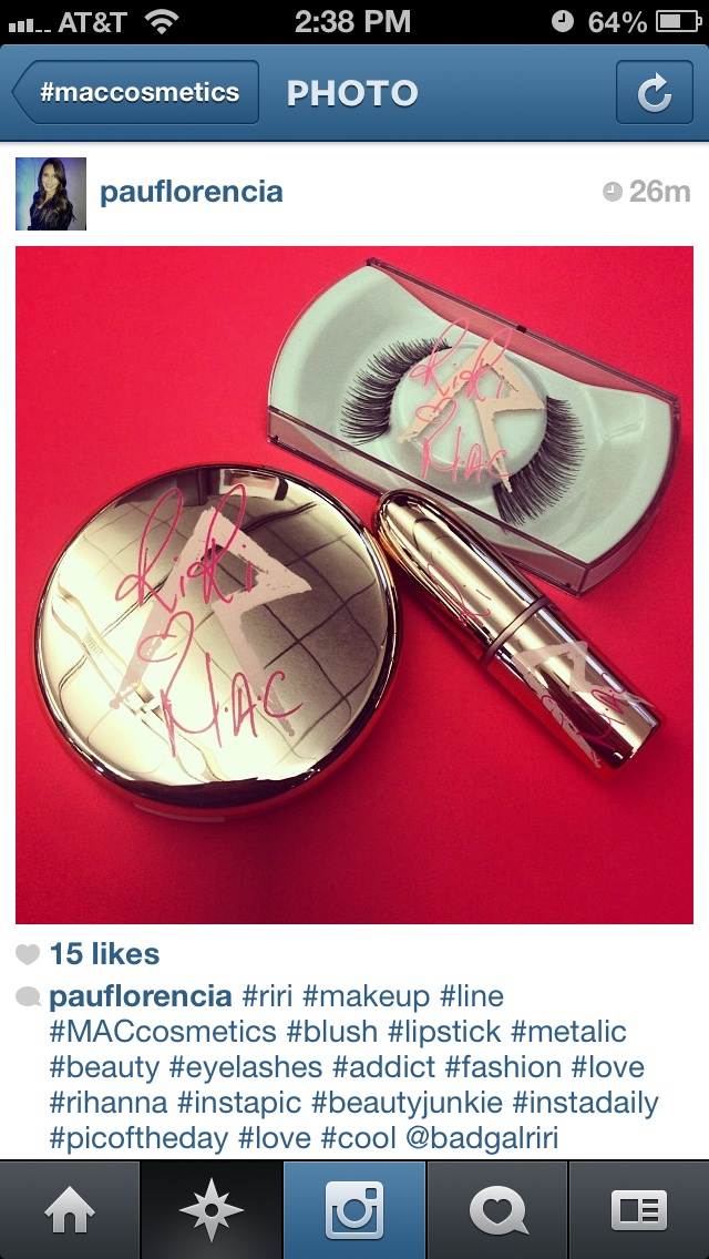
I guess I'm the only one not bothered by the r. My name starts with it and it reminds me of the runic symbol. I was really into Norse mythology as a kid. I know, super geeky. But I just can't stand the shiny rose gold. I think it looks super cheap, kind of like something you would get at Claire's. Plus it's really gonna stand out on my vanity. So ugly. I'm considering skipping TTT because of it. Hopefully swatches will reveal good dupes.I think I will use some saturated alcohol and a sharp knife or tweezer to scrape off those reduntant R's