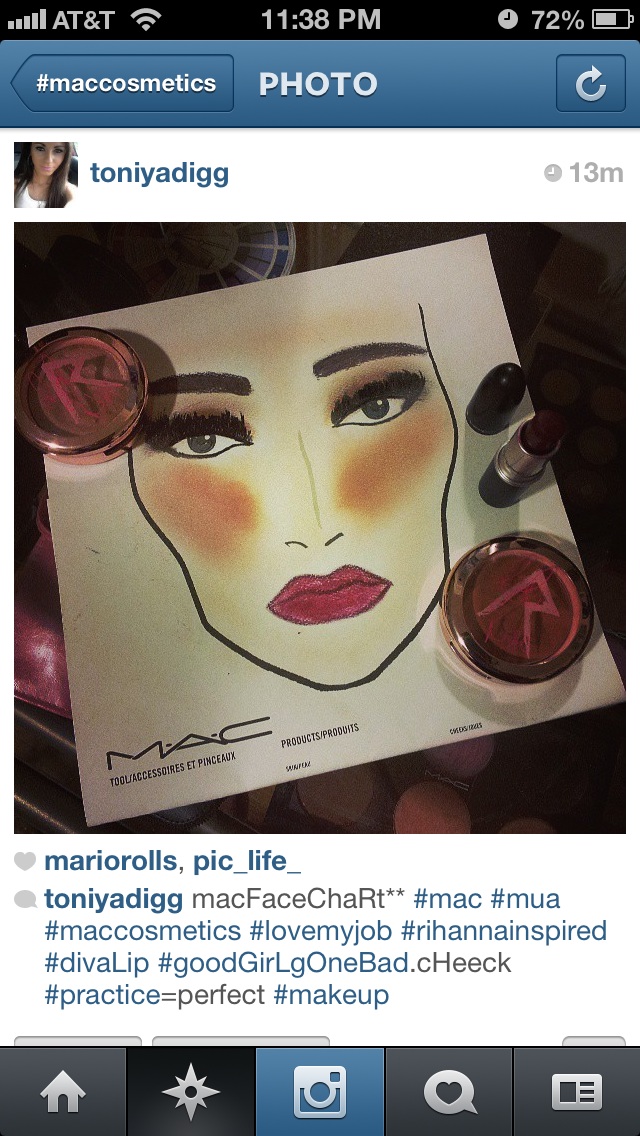
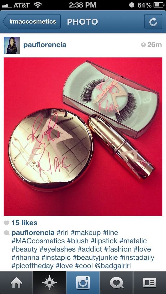
RiRi Hearts MAC Fall Collection (October 3, 2013)

P

pockykami

Guest
I think I will use some saturated alcohol and a sharp knife or tweezer to scrape off those reduntant R's
I guess I'm the only one not bothered by the r. My name starts with it and it reminds me of the runic symbol. I was really into Norse mythology as a kid. I know, super geeky. But I just can't stand the shiny rose gold. I think it looks super cheap, kind of like something you would get at Claire's. Plus it's really gonna stand out on my vanity. So ugly. I'm considering skipping TTT because of it. Hopefully swatches will reveal good dupes.
 

miss0annette

Well-known member
I don't know but I laughed when I saw the eyelashes case. Credit to the Instagram user.
a4800dbe_image.jpeg
 

NaomiH

Well-known member
Oh thank God! I couldn't tell on my phone and I was really wondering what the hell were they smoking adding those lines. LOL. I'm going to try and de-pot anything I get from this collection.
The crisscrossed lines are the reflection of the ceiling. But the signature and giant R are bad enough lol.
 

BrinaBoo10

Well-known member
LOL at MJ. The design is way too busy. There should have been a MAC by Request for this packaging so we could have voted against it.
 

martiangurll

Well-known member
I guess I'm the only one not bothered by the r. My name starts with it and it reminds me of the runic symbol. I was really into Norse mythology as a kid. I know, super geeky. But I just can't stand the shiny rose gold. I think it looks super cheap, kind of like something you would get at Claire's. Plus it's really gonna stand out on my vanity. So ugly. I'm considering skipping TTT because of it. Hopefully swatches will reveal good dupes.
okay, I'll bite, what does the Norse rune that looks like an R mean? It could help me like the packaging. I should know this...I also hate the rose gold, it looks like Estee Lauder Packaging's cheaper, ho-ish cousin
 

brittbby

Well-known member
okay, I'll bite, what does the Norse rune that looks like an R mean?  It could help me like the packaging.  I should know this...I also hate the rose gold, it looks like Estee Lauder Packaging's cheaper, ho-ish cousin
Hahahahahahahahahahahahaha!!!!
 

lilinah

Well-known member
I don't mind the rose-gold - although it may look different in person. Baaaack in the ooooold daaaays, make up pretty much all came in gold-colored metallic cases, so if this is metal, i'll be happy. But if it's just thin metallic-look foil over flimsy plastic, well, i think that'll be just tacky.

I generally avoid clothing and accessories with logos - OK, i expect MAC products to say MAC - but i won't buy a purse with logo cloth all over it - they should pay me to be a walking advertisement. So i don't like the signature and the awful R.

Now, if the color of an item is nice, i know i'll be lining up to get it, but i'm sure not buying anything for the "special" packaging. Right now, on my "to check out" list are:
--- Talk That Talk PLW Lipliner - dark plum
--- Talk That Talk Lipstick - matte dark plum
--- Nude Lipstick - cool nude - i like that it looks like milk chocolate!
--- Diamonds Cream Colour Base - soft pink beige with gold pearl
 
Top